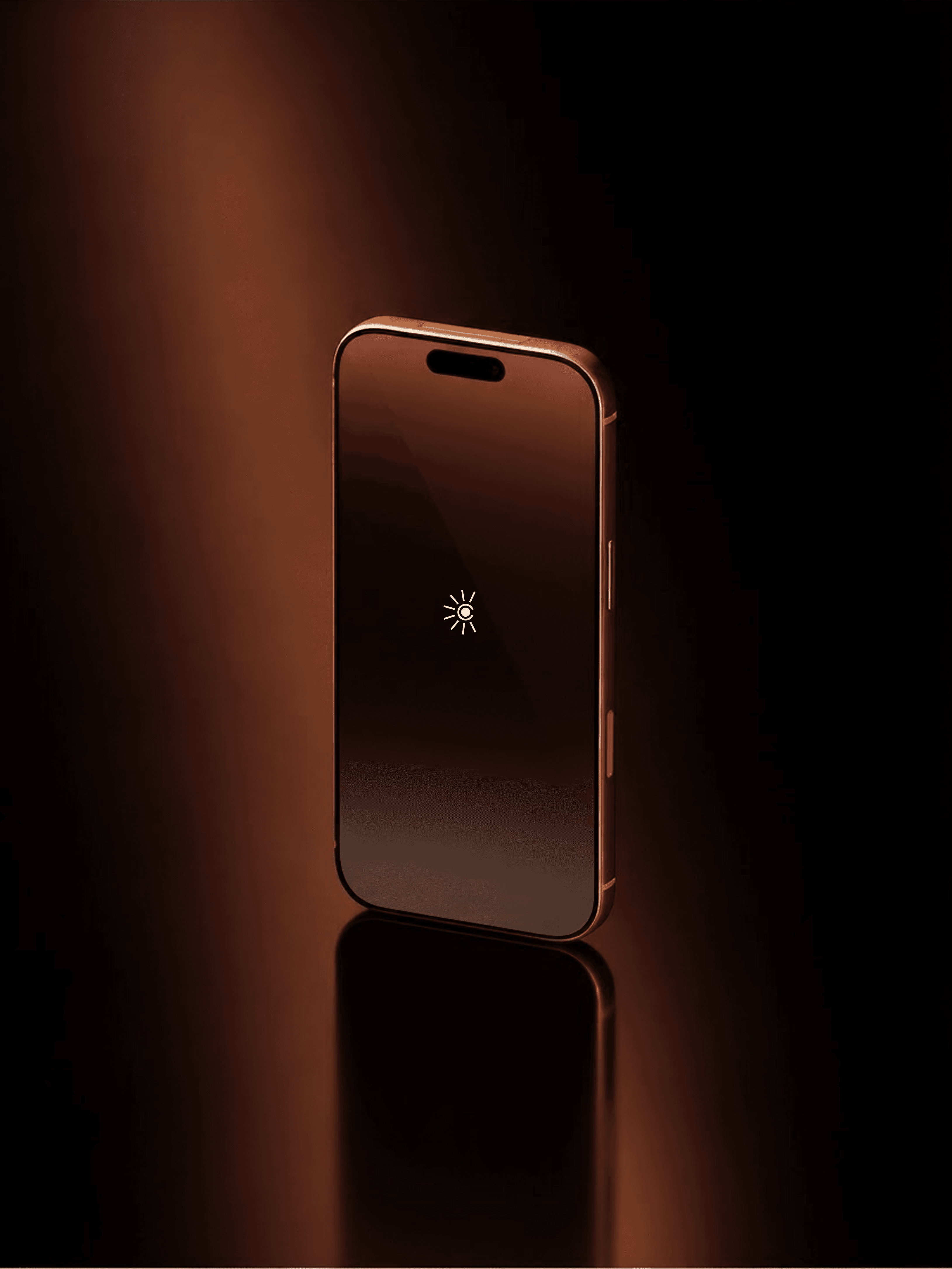
We created a visual identity that allows the product to remain the hero—using understated typography, a warm neutral palette, considered materiality and editorial art direction to build a brand world that feels premium without needing to be loud.
Category:
Strategy & Branding
Duration:
5 – 6 Weeks
Location:
Chennai, India


[05]
//OUR METHODOLOGY
How We Work
The identity is deliberately quiet — a classical serif with a single point of light held inside a terracotta and charcoal palette, and stationery and packaging designed to feel considered in the hand rather than loud on a screen. Luxury signalled through restraint.
STAGE 1
Define the brand before the visuals
Positioning, tone and the standard the identity had to meet. In this category, restraint reads as confidence and excess reads as new.
STAGE 2
Build the identity system
Wordmark, palette, packaging and stationery designed to hold together across print, product and screen.
STAGE 3
Produce the campaign world
Mobile product photography turned into a full campaign visual system through AI-led production, art-directed frame by frame to match the brand it was built for.

The strongest brands are built before the first visual is designed, so the work began with the category itself: where the space for distinction actually sat, and what a brand world could look like beyond typical beverage cues. Naming came first. Then positioning, identity, packaging and the communication system — each one answering the same question rather than decorating the last.